 When clients ask me to redesign their email creative to increase click-through and conversion, I often find that they are quite surprised at how much time and effort we invest into fine-tuning call to action text links and buttons. There are brand colours to abide by, right? So text links and buttons have to stay in those styles in order to keep the brand police happy. Well, on face value that sounds like a fairly sensible approach, especially if they’re not particularly important. But what happens if you start to challenge these simple elements of your email creative? The potential is huge.
You see, with any computer interaction or usability theory, there’s rarely a simple answer. Words such as “I have read numerous white papers that suggest that red generally works best for buttons, so let’s just go with red buttons everywhere”, or “we’ve got green buttons on our website and they convert better than any other colour on there”, all sound reliable, but they’re nothing more than assumptions.
Assumptions are often where a piece of work like this starts, so they’re not completely useless. They help to spark conversation, which leads to ideas – ideas that then develop into hypotheses. Before you know it, you’ve got a variety of things to test.
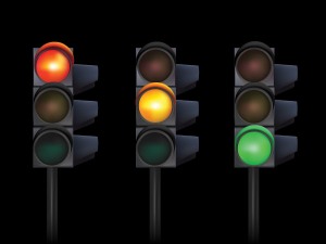
The title of this blog post refers to three colours that I find most commonly used for a call to action. These colours all perform differently based on the sector, brand, proposition, content and so on. This is why you need to test, to see what works best for your brand. Green is associated with ‘go’, so is seen to be a positive action colour. On the other hand, red is obviously associated with ‘stop’, so provokes a reaction too. What is interesting, is that amber or orange is perceived as a colour that suggests something is about to happen and often out-performs all other call to action colours in tests.
Remember that what works for your brand on your website or affiliate campaigns, might not work as well in your email campaigns. When you are trying to interrupt someone in their inbox to convert a browser to a buyer, users are in a different frame of mind, so every call to action needs to work as hard as it possibly can. If you get it right, you could see click-through rates shoot up by as much as 10%, so there is great value in reviewing this area of your email creative. This is why we spend time making sure that these visual signposts are absolutely spot on for our clients. Sometimes simple A/B tests each time you send a mailing can help you find the strongest solution. With email creative that is designed very well already, you would do well to invest in some usability or eye tracking tests to really understand how your audience interacts with your emails.
Don’t be complacent. Start challenging every call to action in your emails and you’ll quickly see the benefits in your results.


